Call Us: 604.856.4799
Request A Quote

Make your own rug: 9 broadloom carpets to turn into area rugs

Area rugs are great for creating high impact change on a tight budget or keeping your feet warm on colder hard surfaces. Turning broadloom carpet into an area rug is a good option for those who are looking for a custom size area rug or have a carpet remnant they like. The carpet is cut to size and the edges are bound to prevent fraying.  We have rounded up our favourite high quality broadloom carpets that would make great area rugs.
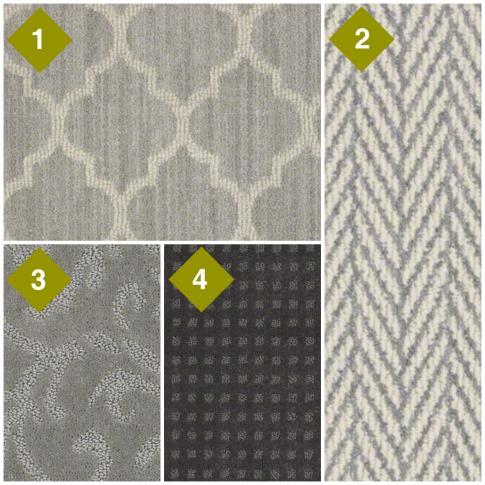
1. This Moroccan quatrefoil design is a classic.

Tuftex Carpet Taza in colour in Silverado

2. Classic herringbone is a sure winner.

Tuftex Carpet Only Natural in colour Violet

3. This floral print creates an air of elegance.

Shaw Carpet Cascade Garden in colour Cloud Burst

4. Subtle squares add a hint of visual interest to any space.

Tuftex Carpet Crystal Visions II in colour After Dark
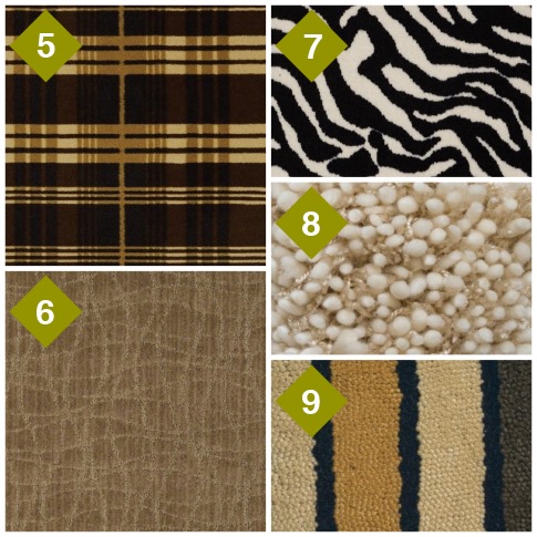
5. Get the cozy rustic look with plaid.

Shaw Carpet Cozy Escape in colour Edinburgh

6. Create the calming feeling of natural waves.

Tuftex Carpet Twist in colour Starfish

7. Zebra print is only for the truly bold.

Shaw Carpet Zebra in colour Call of the Wild

8. Bright yarn adds shimmering highlights to the textured wool carpet.

Unique Carpets Illumination in colour Golden Sand

9. Thick and thin bands of colour create a uniformed and balanced pattern in this wool carpet.

Unique Carpets Vintage Stripe in colour Boardwalk


Try on a Floor – Review of Shaw’s Virtual Flooring

It can be challenging to visualize how your new floors will look in a room from just a flooring sample. Shaw’s “Try on a Floor” online virtual flooring tool eliminates the guesswork by letting you try on flooring in your own room! We gave it a try with a room in our office and a few job photos. Here’s a few tips and tricks to make the most of this great online tool.

How to take the photo

To get the best photo of your room Shaw recommends the following:

1. Move plants, decorative items and area rugs out of the shot. Avoid mirrors that reflect the floor. (We learnt this lesson the hard way – see if you can spot it!)

2. Take the photo during the day with natural light behind you and lights on to avoid shadows.

3. Set your camera’s resolution on high to ensure a sharp image. (We took photos of the MIRA office with an iPhone 5 and they worked well!)


Upload photos to Shaw

1. To upload photos to “Try on a Floor”, you’ll have to become a member first. Create a new account with your email address or login with Facebook here: https://shawfloors.com/hub/login.aspx

2. Once registered, go to the photo uploader here: http://shawfloors.com/tryonafloor.aspx?mode=uyo. Shaw has a great video demonstration to show how to upload your photos and prepare your floor.

Prepare your floor

1. Define your floor. We recommend doing a quick outline with the Add Area tool. Then zoom in to the photo and do touch-ups with the erase and add area brushes.

2. Create a grid by drawing a line from the one end of the farthest baseboard to another end. Align your floor by adjusting the grid’s rotation and tilt.

3. Change the scale of the grid to match the scale of your room.

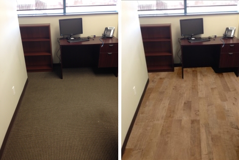
Your photo is now ready to try on new flooring options! The process looks confusing but it is very simple. The three steps only took us about three minutes for the office photo and 5 minutes for each of the job site photos.

Here’s a before and after of our showroom. Goodbye commercial carpet, hello hardwood floors! (Hardwood style Lewis and Clark, Colour Pacific)

We also tried a few before and after’s with some photos from a recent new build job.

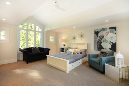
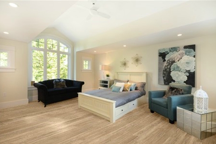
The carpet in this bedroom was replaced with a trendy white oak visual laminate. (Laminate style Cantebury, colour Thyme)

Bedroom original

Bedroom laminate

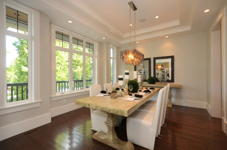
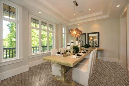
We swapped out the dining room hardwood with a bold patterned carpet. (Carpet style Caldonia, colour Sesame)

Dining room original

Dining room carpet

Don’t have a camera or time to upload a photo? You can use one of Shaw’s pre-made room scenes instead. You can change the colour of the walls and furniture of the pre-made room scenes to look more similar to your own home.


Best floors for good resale value

Hardwood floors, good for resale value?

If renovation plans are part of your new years resolutions, it’s a wise decision to consider how the renovation will affect the resale value of your home. Instead of guessing if hardwood floors will increase resale value, the Appraisal Institute of Canada has the answers for you. The institute surveys its members to find out what renovations had the highest impact.

The institute has three basic guidelines that apply for anyone embarking on a renovation:

  • Amount of money spent isn’t everything. The changes you make must be in line with current trends to appeal to the majority of buyers.
  • Beware of passing fads. If you aren’t planning to sell your home right away, passing fads will make your home look dated when it is time to sell.
  • Avoid projects that will dramatically set your house apart from others in the neighbourhood. Renovations on homes that are already above the average value of the homes in the neighbourhood will return less on the investment.
Best floors for strong resale value

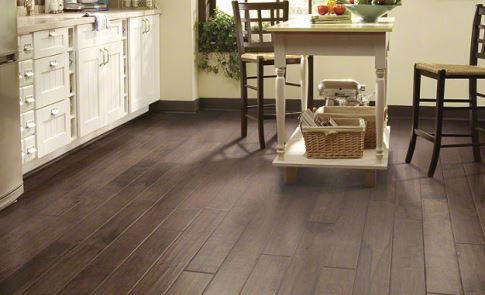
1. Hardwood floor installation – Wherever you install it, you can expect to have 50% to 75% of your investment recovered in the resale price.

2. Kitchen flooring – Upgrades to the kitchen usually result in 75% to 100% of the investment recovered. We recommend tile or engineered wood as the best return on investment for this room.

3. Bathroom flooring – Bathroom upgrades have 75% to 100% of their investment recovered. Tile is the best choice for the bathroom. However, if that’s not in your budget and you have a 1970’s vinyl that needs to go, even replacing it with a modern looking luxury vinyl tile will bring the space into the current decade.

4. Unfinished basement flooring – Finishing off an unfinished basement brings a 50-75% recovery of investment. We recommend a warm and cozy carpet to transform an unfinished basement into a liveable space.

Want to know how other renovation projects will increase the resale value of your home? A full list can be found here.

Best websites to inspire your renovation

Best home renovation inspiration


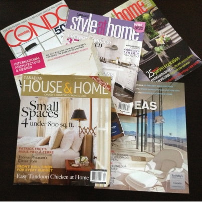
Inspiration for your home is everywhere – home shows, magazines, or even a walk through your favourite stylish neighbourhood. Here’s a few of our favourite magazines and online resources to look at when gathering inspiration for your next renovation.

Local inspiration

Western Living Magazine
This magazines and it’s website is a comprehensive guide of everything new and unusual in Western Canada, from Winnipeg to Victoria. Their Homes section showcases a stunning selection of homes and condos in Western Canada’s, design tips and new trends in décor.

Westcoast Homes and Design
Every issue of this magazine is full of Vancouver’s best local architecture and creative design trends. By browsing through local homes, there’s a better chance that the products used to create that space will be local. By keeping it local, you’re less likely to fall in love with the backsplash tiles in the photo, only to discover that the product cannot be imported to Canada.


Keep track of your ideas

Houzz
The Houzz website is 100% dedicated to home improvement and interior design. Their extensive library has well-written articles to help you through all stages of a home renovation or design project. Browse through the inspiring photos posted by other users and create an account to save your favourites to your own ideabooks.

Pinterest – The tremendously popular social media site is filled to the brim with renovation and interior design ideas. You can explore the Pinterest Home Decor category or create your own pin board to keep track of the great ideas you find on Pinterest and other websites.


Modern and Minimal

Dwell
This magazine and it’s website demonstrates functional and comfortable modern design. While many photos of modern design homes often look like no one lives there, Dwell’s goal is to show modernist designed homes lived in by real people.

Better Living Through Design
The Better Living Through Design website is a great resource for those yearning for the best eye-catching modern furniture and design options on the internet. The products featured could be from anywhere at the world and at any price point. No searching is required to find the product since each product has a direct link to the retailer.

Retro living

Retro Renovation
Love the sets of Mad Men and have a soft spot for shag carpets? Then Retro Renovation is the site for you.  This website is a comprehensive guide to renovating and decorating your house mid-century style.


Small-spaces

Apartment Therapy
Apartment Therapy is an ode to making the most of small space living. This website boasts inspiring before and after posts, great storage and organization advice, and a video how-to series. Living in 1000 sf or less has never looked so good!

Have other favourite home renovation and decor websites that we forgot to mention? Let us know about them in the comments.

5 ways to make small spaces look bigger

Small living spaces are getting much attention in Vancouver, like the recently released 297 sf condo units in Surrey known as “Canada’s Smallest Condos. Whether you are living in 300 sf or there are a few rooms in your home that feel a bit tiny, there are lots ways to trick the eye and make rooms appear larger.  Here are our top five tips to make the most of any small space:

1. Repaint to make a statement.

Darker colours absorb light and give the illusion of less space while light colours reflect and multiply light.  To keep the room bright and airy, try painting the walls cream, beige, or even a light blue-grey.

2. Use floors as a fifth wall

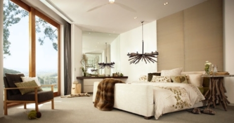
Floors are like a fifth wall – they are another surface for light to reflect off of. Choosing a light coloured floor will make the room appear brighter and more open. The nature inspired bedroom below uses light coloured wool carpet from Godfrey Hirst and off-white walls to keep this room feeling open.

Light carpet and paint creates an open room

3. Go big with flooring

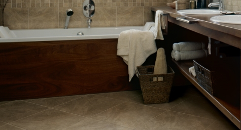
The World Floor Covering Association recommends using larger flooring to make the room look bigger. Whether it is planks, tiles, or patterns, go big. If you tiles are picked, trying laying them on a diagonal to make the room appear even larger. Laying these tiles diagonally creates a longer line for the eye to follow and a big visual impact on this tiny bathroom space.

Ceramic tiles in bathoom

4. Let the light in.

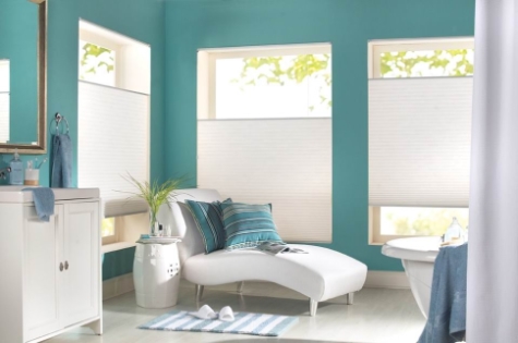
Make use of natural light whenever it is available. Use sheer window coverings or ones you can pull back to allow in more sunlight. To maximize light, try placing a wall mirror to reflect natural light from windows. Cell shades from Shade-O-Matic like the ones below, have sheer fabric options that allow privacy without sacrificing sunlight.

Sheer shades

5. Cut out the clutter and reorganize.

A cluttered space looks like a small space. Clearing out clutter is the easiest and least expensive way to make a cramped room feel open. Get rid of any unnecessary pieces of furniture or knick-knacks. Replace old single-use furniture with multi use-furniture that doubles as storage to keep your personal items hidden.

« Previous Page  Next Page »
WCFA ICC Greater Langley Chamber of Commerce Insurance Brokers Association CHOA Greater Vancouver Home Builders Association Better Business Bureau BCAOMA Aviva