What do wine and flooring have in common? Nothing really, until now.
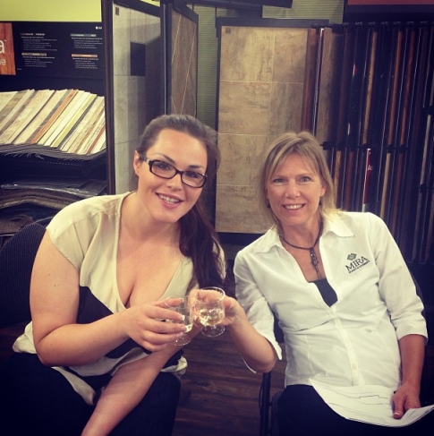
Every few months the Mira team does an in-office wine tasting. It’s a bit of fun for the office team and gives us a chance to try staff favourites and wines recommended by customers.
This month’s contenders are:
 Sauvignon Blanc – Oyster Bay Marlborough 2012
This New Zealand wine is a crowd pleaser that is well suited for long afternoons on the patio in the coming summer months. The Mira team thought this was a light, refreshing wine with a fruity palate. The lively fruit tones are well-balanced by the wine’s crisp acidity.
Valdepenas Gran Reserva – Anciano Aged 10 Years
This full-bodied Spanish wine was recommended to us by one of our newsletter readers. By law, all Gran Reserva wines must be aged for a minimum of 5 years before they are released. They spend 18 months in an oak cask and 42 more months bottled and cellared. The Mira team members who preferred the red loved its complex fruit flavours that lead into a long, drawn-out finish.
The winner?
Leading by just one vote, the Oyster Bay was declared this rounds winner.
Have a great wine you think we should try for our next office tasting? Let us know in the comments.


Posted on Jun 17 2013 4:30 pm by Kelsey Shipley
|
category: MIRA Wine Club |
Leave a comment
Carpet tiles were introduced to the market over 60 years ago but their popularity has rapidly grown during the past decade. Modular carpet tiles are becoming the soft surface of choice for offices, retail spaces, hospitality, and even apartment buildings. They are even popping up in residential spaces that want something more unique than the traditional wall-to-wall carpet look. Here are three reasons why we love using carpet tiles.
Endless unique design possibilities
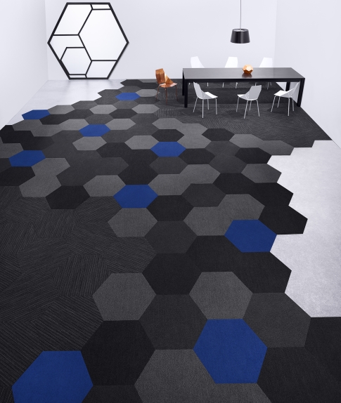
With many offices moving away from cubicle farm layouts and embracing open spaces, designers are given larger areas to work with. Open spaces give them a chance to be more creative and try elaborate large scale designs like these new hexagon tiles from Shaw Contract.

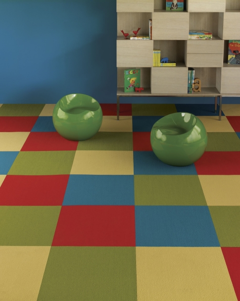
Bold statements can be made using a combination of different tiles. These bright tiles can be used to add punches of colour to a pattern or many different colours can be put together to create your own pattern.

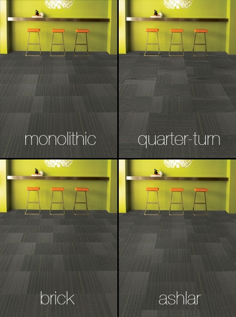
Using different installation methods can create an entirely different looking carpet for some patterned carpets. Each of the different installation methods below creates a different look for one style of carpet tile.

The versatility of carpet tiles allows customers to have a custom looking carpet without the cost of ordering a custom made product.
Simple to replace damaged areas
When carpet is stained or damaged, modular tiles are easier to replace than broadloom carpet. When doing a repair for broadloom carpet, a whole roll of broadloom carpet needs to be dragged down from storage, cut and seamed in. With carpet tiles repairs are much easier. Simply remove the damaged tile and put a new one back in. Wear patterns can be minimized by replacing and rotating select tiles rather than replacing the entire floor when broadloom carpet wears out.
Easier transportation and storage
12 foot rolls of carpet and a highrise elevator are not an ideal match. On installation day, it is much quicker and easier for our crews to move boxes of carpet tile instead of bulky broadloom rolls. Businesses that choose to buy extra materials to keep for repairs use less space to store a 2′ x 2′ box of carpet tiles than a 12 foot long roll of carpet.
Posted on Jun 12 2013 1:40 pm by Kelsey Shipley
|
category: Carpet Flooring |
2 Comments
Small living spaces are getting much attention in Vancouver, like the recently released 297 sf condo units in Surrey known as “Canada’s Smallest Condos“. Whether you are living in 300 sf or there are a few rooms in your home that feel a bit tiny, there are lots ways to trick the eye and make rooms appear larger. Here are our top five tips to make the most of any small space:
1. Repaint to make a statement.
Darker colours absorb light and give the illusion of less space while light colours reflect and multiply light. To keep the room bright and airy, try painting the walls cream, beige, or even a light blue-grey.
2. Use floors as a fifth wall
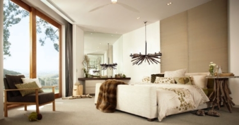
Floors are like a fifth wall – they are another surface for light to reflect off of. Choosing a light coloured floor will make the room appear brighter and more open. The nature inspired bedroom below uses light coloured wool carpet from Godfrey Hirst and off-white walls to keep this room feeling open.

3. Go big with flooring
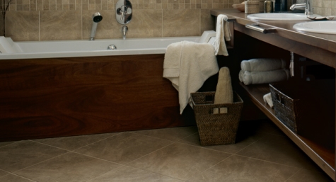
The World Floor Covering Association recommends using larger flooring to make the room look bigger. Whether it is planks, tiles, or patterns, go big. If you tiles are picked, trying laying them on a diagonal to make the room appear even larger. Laying these tiles diagonally creates a longer line for the eye to follow and a big visual impact on this tiny bathroom space.

4. Let the light in.
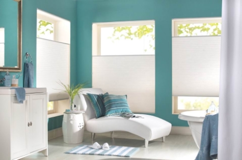
Make use of natural light whenever it is available. Use sheer window coverings or ones you can pull back to allow in more sunlight. To maximize light, try placing a wall mirror to reflect natural light from windows. Cell shades from Shade-O-Matic like the ones below, have sheer fabric options that allow privacy without sacrificing sunlight.

5. Cut out the clutter and reorganize.
A cluttered space looks like a small space. Clearing out clutter is the easiest and least expensive way to make a cramped room feel open. Get rid of any unnecessary pieces of furniture or knick-knacks. Replace old single-use furniture with multi use-furniture that doubles as storage to keep your personal items hidden.
Posted on Jun 4 2013 3:38 pm by Kelsey Shipley
|
category: Renovation Design Tips |
Leave a comment
 Sauvignon Blanc – Oyster Bay Marlborough 2012